Chart Types
Surview team has developed several chart types that are automatically generated to represent your survey results. The chart types are available depending on the question types used in the survey.
Chart Types:
Horizontal or Vertical Bar Graph – available in all closed-ended questions.
To apply:
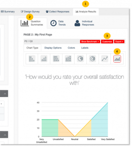
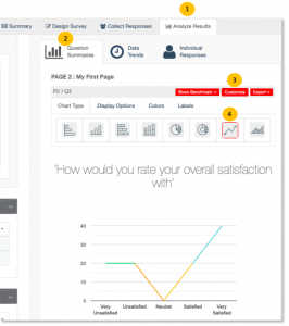
1. Go to the Analyze Results tab.
2. Click the Question Summaries.
3. Choose a survey response that you wish to display as chart, then click on the upper right of the question.
4. Select the horizontal or vertical bar graph and the preview will be automatically displayed.

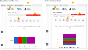
Stacked Horizontal or Vertical Bar Graph – available in all closed-ended questions.
To apply:
1. Go to the Analyze Results tab.
2. Click the Question Summaries.
3. Choose a survey response that you wish to display as chart, then click on the upper right of the question.
4. Select the Stacked horizontal or Stacked vertical bar graph and the preview will be automatically displayed.
Pie Chart – applicable in closed-ended questions with a single answer choice allowed, except for Matrix/Rating Scale.
To apply:
1. Go to the Analyze Results tab.
2. Click the Question Summaries.
3. Choose a survey response that you wish to display as chart, then click on the upper right of the question.
4. Select the Pie Chart and the preview will be automatically displayed.

Donut Chart – applicable in closed-ended questions with a single answer choice allowed, except for Matrix/Rating Scale.
To apply:
1. Go to the Analyze Results tab.
2. Click the Question Summaries.
3. Choose a survey response that you wish to display as chart, then click on the upper right of the question.
4. Select the Donut chart and the preview will be automatically displayed.

Line Graph – available in closed-ended questions where Depth is set to Distribution.
To apply:
1. Go to the Analyze Results tab.
2. Click the Question Summaries.
3. Choose a survey response that you wish to display as chart, then click on the upper right of the question.
4. Select the Line graph and the preview will be automatically displayed.
Area Graph – available in closed-ended questions where Depth is set to Distribution.
To apply:
1. Go to the Analyze Results tab.
2. Click the Question Summaries.
3. Choose a survey response that you wish to display as chart, then click on the upper right of the question.
4. Select the Area graph and the preview will be automatically displayed.